Introducing
Flexbox Containers

Harness the power of CSS Flexbox for super flexible and responsive layouts to
create your most advanced designs
Elementor 3.6

Design Advanced Layouts

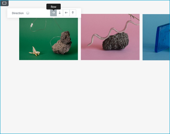
Flex your creative muscles with Flexbox - Elementor’s new building block that empowers you to efficiently lay out, align and distribute items in a Container in an ultra lightweight and responsive way.

Freedom to Shape
Your Layouts & Positions

Drag your widgets into the Container and position them in any way you want.

Design any Layout in Minutes

Place your items in a column or a row

Wrap items so they fit comfortably on any device

Define the spacing between items

Align and justify them so they look just right

Nest Your Containers With No Bounds

Build complex layout patterns by nesting any number of containers and items so they can easily be aligned, ordered, spaced and scaled in a horizontal or vertical direction.

Make Your Website Look
Great on Any Device

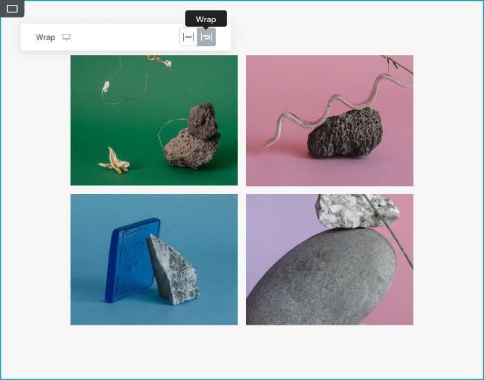
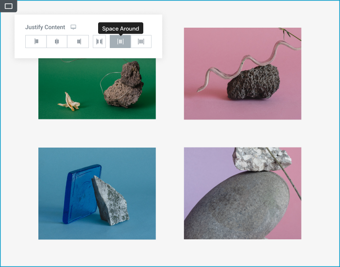
Design your website for each device and create the perfect user
experience while keeping performance running in top form.
Use different breakpoints to determine how items grow and shrink, adjust the direction, distribution, or order, to fit on every screen size, without duplicating content.

Greater Performance, Less Code

Lightweight, Lean and Clean

Flexbox Containers have fewer wrapping elements which generate less code, so your website loads and runs so much faster.

Learn How To Use Flexbox Containers

Learn how to build your next website with Flexbox Containers today

Elementor is the leading website builder platform for professionals on WordPress. Elementor serves web professionals, including developers, designers and marketers, and boasts a new website created every 10 seconds on its platform.

© Elementor. All rights reserved